UIDAI India
Project Overview
Purpose
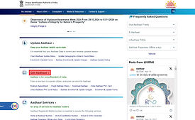
This Ux research project aims to evaluate and provide design recommendations for the usability of the Unique Identification Authority of India(UIDAI) website which is a crucial platform for Indian citizens to access "Aadhaar" related services.
"Aadhaar" is a 12-digit unique identification number issued to every Indian resident by the Government of India based on their biometric and demographic data.
Role: Sole researcher ,Moderator and Designer
Approach
I approached this project in 3 stages.
-
Research
-
Ideate
-
Design


Understand
Target Users
-
Aadhaar Cardholders: Individuals who own or have enrolled for Aadhar and need to access services related to their Aadhar card .
Research Questions
-
How intuitive is the overall navigation and information architecture of the website, particularly for first-time users?
-
What are the primary challenges and frustrations users encounter when attempting to complete Aadhaar related tasks ?
-
How well does the website guide users through complex processes , such as finding Enrollment centers?
-
How satisfied are users with the overall user experience of the UIDAI website, including factors like visual design, content clarity , and ease of use?
Research Methods
-
Heuristic Evaluation: An Evaluation was conducted using Neilsen's 10 usability heuristics to identify potential usability issues.
-
Cognitive Walkthrough: Three key tasks were analyzed to identify possible user challenges by simulating how users would approach and complete each task .
-
(Quant) Online Survey: An online survey was conducted to gather quantitative data on user behaviors and pain points.
-
First Click test: The Initial user action was tested to determine if users were able to identify the correct pathway from the outset.
-
Usability Testing: It involved observing participants as they interacted and performed three tasks .
-
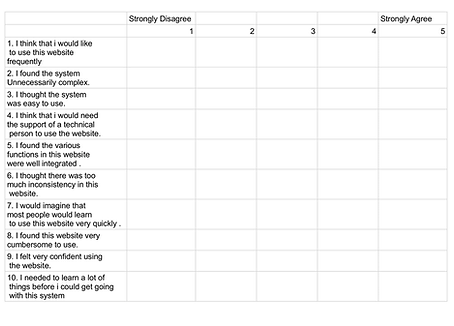
(Quant) Questionnaires: To collect quantitative data on users standardized questionnaires like SUS, ASQ, and NPS was employed.
-
Card Sorting: A card sorting was conducted to understand user's information organization preferences.
-
Follow-up User Interview: A follow up user interview was conducted to assess the effectiveness of the redesigned website.
Recruitment
-
Online surveys, First-Click Tests, and Card Sorting: Recruited from personal network, Facebook groups focusing on individuals residing in India to ensure cultural and contextual relevance.
-
Usability Testing : Recruited through primarily personal network residing in India and owned an Aadhaar card
-
Follow-up Interviews: For effective comparison between the original website and the proposed design, participants for usability testing and follow-up interviews were recruited from the same pool.
Heuristic Evaluation
By conducting a heuristic evaluation as the first step for the User research , i have established a solid foundation for understanding and addressing potential usability issues.
This initial assessment provided a comprehensive overview of the website's strengths and weaknesses , allowing me to prioritize areas for improvement and focus on subsequent research methods.
Key Touchpoints:
-
The most prevalent issues were related to Recognition rather than recall, consistency standards, and error prevention.
A. Visibility of System Status
Issue: The website could provide more real-time feedback, especially during long loading time or error states
B. Match between system and real world
Issue: Some terminology used on the website might not be immediately understandable to all users.
C. User Control and Freedom
Issue: Users may feel trapped in certain workflows, particularly when dealing with errors or unexpected situations.
D. Consistency and standards
Issue: Inconsistencies in visual design elements, layout, and terminology can confuse users.
E. Error prevention
Issue: The website could provide more proactive error prevention measures to reduce user frustration.
F. Recognition rather than recall
Issue: Users may have difficulty remembering information or navigating to specific sections of the website.
G. Flexibility and efficiency of use
Issue: The website could be optimized to reduce the number of steps required to complete common tasks.
H. Aesthetic and minimalist design
Issues: The website's visual design could be improved to enhance the user experience.
I. Help recognize and recover from errors
Issue: Error messages may not be clear or actionable.
J. Help and documentation
Issue: The website's help and documentation could be more user-friendly and accessible.
Cognitive Walkthrough
Cognitive walkthrough offers a more granular view into specific user tasks on the UIDAI. By simulating user behavior , i can identify potential roadblocks and areas of confusion that might be missed in a broader heuristic analysis.
For this study , i used the individual cognitive walkthrough method on the three tasks i chose for the usability studies.
-
Task-1: Locate an Aadhar enrollment center
-
Task-2: Verify Aadhar card
-
Task-3: Book an appointment at an Aadhar seva Kendra
Key challenges Identified :
Inconsistencies in Navigation: The placement of the "Locate Enrollment Center" option within the "Get Aadhar " section might not be intuitive for all users.
Unclear Terminology: The term " Bhuvan Aadhar " could be confusing for users unfamiliar with the language Hindi , as according to 2011 Census , about 680 million people do not speak Hindi as their first language.
Visual Clarity : Certain elements , such as the "Check Aadhar Validity" button, could be made more visually prominent.
Along every task i answered Lewis and Rieman's 4 questions:
_page-0001.jpg)
_page-0002.jpg)
_page-0003.jpg)
_page-0004.jpg)
Online Survey
While heuristic evaluation and cognitive walkthrough can provide valuable insights , an online survey can complement these methods by directly gathering user feedback.
By surveying users, we can gain a quantitative understanding of their experiences, attitudes, and preferences.
Key insights:
-
Dominance of Offline Aadhar Acquisition
-
Limited awareness of the term "Bhuvan Aadhar" which is frequently used throughout the website.
-
Among the users who have used the website, checking Aadhar status and downloading aadhar are the most common tasks.
![Slide6[1].jpg](https://static.wixstatic.com/media/7b76cc_d06f2c8f67f044e5bc18b2f018214dd9~mv2.jpg/v1/fill/w_439,h_250,al_c,q_80,usm_0.66_1.00_0.01,enc_avif,quality_auto/7b76cc_d06f2c8f67f044e5bc18b2f018214dd9~mv2.jpg)


First Click Testing
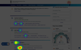
First-click testing, provides valuable information into user's initial interactions. Since the UIDAI website's homepage is crucial for guiding users to essential functions, a first-click test can specifically assess the effectiveness of the home page's information architecture and the clarity of it's call to action.
To evaluate the navigational clarity on the website , i conducted First Click Testing for three essential tasks:
-
Task-1: Locate an Aadhar enrollment center
-
Task-2: Verify Aadhar card
-
Task-3: Book an appointment at an Aadhar seva Kendra
Key Insights:
-
Users were drawn to links containing specific keywords rather than relying on the overall information hierarchy.
-
Faced difficulty in some tasks like booking appointment that suggest the website's information architecture may not be optimized .
-
Struggled to locate specific functionalities, particularly for tasks like " Locating an Aadhar enrollment center" which suggest the website's navigation structure might be confusing or inconsistent.
Expected Clicks
Task-1
Task-2
Task-3


Actual Clicks


Usability Testing
Usability testing , following first-click testing provides a deeper understanding of user behavior and identifies specific usability issues.
By observing users as they interact with the UIDAI website , we can gain valuable insights to improve the website's design, reducce user frustration, and enhance the overall user experience.
Inclusion Criteria
-
Over 18 years old
-
Citizen of India
-
Resides in India
-
Owns an "Aadhar" card
-
Read and respond in English
-
Comfortable using Computer and Internet
-
Access to Zoom or similar video comm software
Methodology
A remote usability test was conducted with five participants . Participants were asked to complete three primary tasks:
-
Task-1: Locate an Aadhar enrollment center
-
Task-2: Verify Aadhar card
-
Task-3: Book an appointment at an Aadhar seva Kendra
Key Findings
-
Navigation Challenges: Users struggled to locate specific functionalities, particularly the "Locate Enrollment Center" option.
-
Unclear Terminology: The term "Bhuvan Aadhar" was confusing to many participants.
-
Task 3 Issues: All participants encountered issues with OTP delivery , preventing task 3 completion.
-
Difficulty in Map Interpretation :Users expressed difficulties in interpreting the map provided to locate enrollment centers.
-
User Interface and Information Architecture: The website's visual design and information hierarchy could be improved for better user experience.
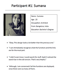
Key Quotes


Questionnaire
ASQ
To gather quantitative data on user satisfaction and experience , standard questionnaires were used :
-
System Usability Scale (SUS) : This scale measures the overall usability of the system . It provides a quantitative score that can be used to compare different iterations of the design.
-
Net Promoter Score( NPS) : This metric measures customer loyalty and satisfaction. It asks participants to rate their likelihood of recommending the website to others on a scale of 1-10.
-
After Scenario Questionnaire ( ASQ): This questionnaire measures user satisfaction with specific tasks and provides insights into the ease of use and clarity of instructions.

SUS

NPS

Participants Performance Data
The data sheet is a detailed record of the users behavior during the usability test. It tracks task completion time, errors, non-verbal cues, and post-test feedback to identify usability issues, measure user satisfaction, and inform design improvements.
Key Insights:
-
Participants struggled with task completion, particularly those involving OTP verification and complex procedures.
-
The website's user interface was found to be confusing and inconsistent, leading to user errors and frustration primarily due to it.


Card Sorting
Card sorting was conducted to gain insights into how users mentally categorize information and to address the information architecture issues identified in the usability and the first-click test.
The exercise was conducted with 10 participants. To address the limitations of the existing category structure, additional categories were introduced.
Key Insights:
-
The results reveled that the participants found the new, more specific categories helpful in organizing information and selecting relevant links.
-
By incorporating these findings, we can improve the website's IA and enhance the overall user experience.


User Journey Maps
By conducting user journey mapping after the user research, I visualized the user experience, identify pain points , and prioritize design improvements. This approach helps me create a more empathetic and user-centered design for the UIDAI website.
Key touchpoint:
-
By empathizing with the user's journey , i can prioritize the design improvements that address these pain points and create a more intuitive experience.

Ideate
Compiling Insights
The user research phase produces a lot of information and insights. It is important to distill these findings into a fundamental objective by:
-
Curating the Data: Organize and structure the collected data
-
Identify patterns and themes: Analyze the data to find recurring trends and insights.
-
Visualize the findings: Create visual representation to facilitate understanding and communication.
-
Develop a design vision: Use the insights to formulate a clear and fundamental objective.
Key touchpoints:
-
After compiling all the insights and findings, the recurring themes in the user research are: Inconsistent information architecture and navigation, suboptimal user interface and visual design, and technical performance issues.
Recurring Patterns

Inconsistent IA and Navigation:
How can we improve navigation and IA to enhance clarity and reduce confusion?
Heuristic evaluation- Consistency and standards, Inconsistent Navigation
Cognitive walkthrough- Task 1 , Action Task 1
First Click testing- Majority of errors were attributed to poor IA and navigation.
Usability test-"The layout is so confusing. There are so many words , i feel like reading a book."
"Im sorry but finding the right link is taking me so long. is it okay if i take my time?"
Poor User Interface and Visual design:
How can we improve the consistency and standards of the website's visual elements?
Heuristic evaluation- Aesthetic and minimalist design, Poor visual clarity
Usability test- "What should i click on ? There's so many things in here."
"I don't understand why there is two booking options ? Which should i click on?"
Website Technical Issues:
How can we improve the readability and speed of OTP delivery to minimize user frustration and abandonment?
Usability test- "Its been almost 10 mins . Why haven't i still received the OTP?"
"I still haven't received the OTP, Shall i make it resend it again?"
Design Vision
A visually appealing, intuitive and efficient platform for Aadhaar cardholders where they can effortlessly access and utilize essential services.
Key touchpoint:
-
Created a design vision to provide clear direction and inspiration , It helped me to align the efforts and ensure that the final product meets the needs of the users.
User Persona
Based on the conducted research, i developed a user persona to represent the typical user of the UIDAI website.
Demographics
Age: 29
Location: Jaipur
Occupation: Software Engineer
Tech savviness: Moderate to high, comfortable with online transactions and digital platforms
Amir- The Frustrated Aadhar user
Amir is a 32 year software engineer living in Bangalore . He occasionally uses the UIDAI website for Aadhar-related tasks but finds it frustrating due to its complex navigation, unclear instructions, and frequent technical issues. He is also concerned about the security of his personal information.
Key touchpoints:
-
Developed this persona based on insights gathered from user research and analysis.
-
It represents a typical user of the UIDAI website highlighting their common pain points, goals, and behaviors.
Never Uses UIDAI website
Occasionally uses UIDAI website
Frequently uses UIDAI website
Goals
-
To efficiently complete Aadhar -related tasks online .
-
Easily navigate the UIDAI website.
-
Understand complex information and instructions.
Pain Points
-
Complex Navigation: Difficulty in finding specific information and completing tasks due to a cluttered and confusing website design.
-
Inconsistent Information: Inaccurate or outdated information on the website, leading to frustration and wasted time.
-
Technical difficulties: Frequent technical issues, such as slow loading times, website crashes and OTP delivery problems.
-
Lack of Clear Instructions: Difficulty in understanding the steps involved in completing tasks , leading to errors and frustration.

Design
Design Solutions
Based on the User research findings and the brainstorming, the following design solutions are recommended to improve the UIDAI website's user experience:
Information Architecture and Navigation:
-
Simplify Information Hierarchy: Reduce the number of steps in the navigation structure and use clear ,concise labels.
-
Improve Search Functionality: Implement a bigger and visually prominent search function that allows users to quickly find specific information.
-
Conduct regular Usability tests: Continuously evaluate the website to identify and address any issues.
Key Touchpoints:
-
Information Architecture and Navigation: Simplify navigation, improve search functionality, and use clear visual cues.
-
User Interface and Visual Design : prioritize clear and concise content, maintain visual consistency, redesign map interface ,and simplify form design.
-
Technical performance: Optimize loading times, improve OTP delivery, and implement robust error handling.
User Interface and Visual Design:
-
Clean and Minimalist Design : Reduce visual clutter and focus on essential information.
-
Improve Map Interface : Enhance the map interface to provide clear and intuitive visual cues for locating enrollment centers.
-
Consistent Visual Language: Establish a consistent visual language , including typography, color palette and layout.
-
Intuitive Form Design: Simplify form fields and use clear labels to guide users.
-
Clear and concise Language: Use simple and direct language to avoid confusion.
Technical performance:
-
Optimize Loading times: Minimize page load times by optimizing images, reducing HTTP requests , and leveraging browser caching.
-
Improve OTP Delivery: Implement reliable OTP delivery mechanisms.
-
Error Handling: Provide clear and informative error messages to guide users in resolving issues.
Low fidelity Prototype
Sketching or low fidelity design at an early stage is crucial to help quickly visualize and iterate on the ideas.
After synthesizing the findings from the research, i developed and iterated on multiple wireframes to address the pain points.
Key Touchpoints:
-
Created multiple low- fidelity wireframes to visualize potential solutions for pages with the most common user pain points.
.png)
_page-0001.jpg)


_page-0001.jpg)


High fidelity Prototype
High- fidelity design is crucial for evaluating the overall user experience and identifying potential usability issues before the final product is developed.
It allows stakeholders to visualize the final product, assess its visual appeal, and test its functionality.
Key touch points :
-
A high fidelity prototype was developed following the theme of the UIDAI and incorporating visual elements and addressing the user pain points.
-
The information architecture was reorganized to optimize the user journey and minimize the number of steps required to complete common tasks.


Follow-up User Interview
To assess the impact of the design changes, a follow-up user interview was conducted with the same participants who participated in the initial study. This allowed for a direct comparison of user experiences and the identification of any remaining usability issues.
Recruitment
Two participants were recruited from the same pool as the original study .
Methodology
The test was conducted remotely with two of the five participants . Participants were asked to evaluate the low-fidelity design and give their opinions on its usability and design.
Key findings :
-
Reduced Cognitive Load: The simplified design reduces the cognitive effort required to interact with the website .
-
Improved Information Hierarchy : The Information is better organized and prioritized , which made it easier for users to find what they need.
-
Effective search functionality: The addition of a prominent search bar has been well-received, allowing users to quickly find specific information.
-
Enhanced Visual Clarity: The new design is more visually appealing and easier to understand with clear and concise icons and labels.
Key Quotes


Reflection
This UIDAI website usability project has been a valuable learning experience for me . Here's a breakdown of the lessons i learnt.
Lessons Learned
-
Balancing Simplicity with Functionality: While simplifying the design enhanced user experience , concerns arose about missing functionalities in the follow up user interview. In future projects , I'll strive to strike a balance between an intuitive interface and ensuring all necessary features are present.
-
The Value of Iterative Testing : Conducting multiple rounds of user testing ( First Click, Usability testing, Follow-up Testing) allowed for continuous improvement and validation of design decisions. This iterative approach will be essential in my future projects.
-
The Power of Heuristic Evaluation and Cognitive Walkthrough: These methods effectively identified the core usability issues , I'll continue to leverage them in future projects as a starting point for identifying potential problems.
Key touchpoints:
-
Prioritize user experience while ensuring all necessary features are accessible.
-
Continuously test and refine designs through multiple rounds of user testing.
-
Leverage Heuristic evaluation and cognitive walkthroughs as they are very effective.
Conclusion
This project aimed to evaluate and improve the usability of the Unique Identification Authority of India (UIDAI) website, a critical platform for accessing Aadhar-related services. Through a series of user research methods, I identified key usability issues, developed a user persona, and ultimately designed and tested a revised high-fidelity prototype.
Key touchpoints:
-
This project evaluated and improved the usability of the UIDAI website through user research, testing and design iterations.
-
By addressing key usability issues , the revised design aims to enhance user experience and streamline the process of accessing Aadhaar -related services for all Indian citizens.
Key Findings:
-
The initial UIDAI website suffered from navigation complexities, Unclear information architecture, and inconsistent visual design.
-
Users struggled with tasks involving OTP verification and complex procedures.
-
Unclear terminology and a cluttered information further hindered user experience.
Design Solutions and User Testing:
Based on the research findings , i proposed design solutions focused on:
-
Streamlining task flows
-
Simplifying information architecture and improving navigation with clear labels.
-
Enhancing visual design and prioritizing user needs throughout.
A revised high- fidelity prototype incorporating these solutions was created and tested with users.
Positive Outcomes:
The revised prototype demonstrated improvements in user experience, with participants finding the design:
-
More visually appealing and easier to understand.
-
Offering a clearer information hierarchy with easier task completion.
Future Considerations:
-
While the revised prototype shows promise, further user testing and iteration are necessary.
-
Its crucial to ensure all essential functions remain accessible despite the simplified design.

